Find Databases search/browse
| Here is a later
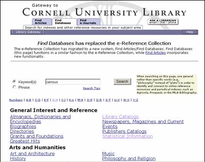
version of one of two new functioning screens we had users test in our
November round. Notice that we went
with the tab approach but used simple, understandable terms, as Jakob Nielsen
recommends and as is the current trend with many library research portals
. From our Library Gateway home page
navigation bar, we planned to include each of these tabs as a separate entry
point into the system: Find: Articles, Databases, and, (later),
e-Journals. |
|
| The screen you
are looking at, Find Databases, allows for resource discovery, what ENCompass
2.0 was calling “Discover a Resource” in that screen I showed you a few
moments ago. You will notice that we
chose to keep searching and browsing on one screen but separated them and did
away with the expandable table/checkbox look and feel. If users wanted to browse through
categories, they could click on a hypertext link and launch a new page,
rather than expanding within the same page.
This approach had been taken with the existing e-Reference collection
and had worked well, so after experimenting with alternatives, we decided to
go with the familiar. |
|
| To try to
clarify the relationship between Find Databases and Find Articles, we added a
scope note to the right of the search box.
Admittedly, this note added “clutter” but became a priority later as
reference librarians submitted their feedback. |
|
| Here is an
example of what you might see if you expanded a browse category below the
search box… |